You are probably ready to create a new website or have been thinking about one, so let's design this bad boy! Before you run to your computers and crank out code, let’s take a step back. Gather your team, some paper, a pen and maybe a graphic designer to draw out your website! You know the old saying: “Measure twice. Cut once.” Well, it works with website building, too. Design first. Redesign second. Code third.
If you have not already, check out our previous Business Website Design blogs. They give you an oppurtunity to Create A Buyer Persona, distinguish an Inbound Methodology strategy, and Plan Out Your SEO. I urge you do so before taking on this step of web design!

Going straight in the code may sound less daunting, and it does saves time. However, this can have an adverse effect when you decide to change things around after seeing it!
Web Design: Where does it all fit?
- Start with the skeleton of the website and build out.
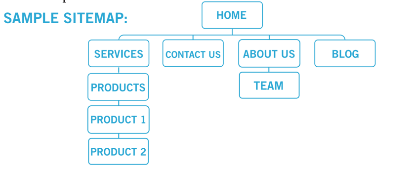
- Create a sitemap with details on items to include in your navigation bar.
- Create drop down lists on each section with the location of each sub-page. Below is a picture of an example sitemap. It does not have to be pretty, but detail is important!

Once you finish the skeleton, grab your best artist and create some work! Make your website visually pleasing for your audience. In other words, it needs to look good! But, remember to make it suitable for the environment.
Web design that keeps your audience in mind
A professional body building website may not want to have the same web design as a medical doctor. Each website needs to reflect the public’s perception of the type of business. Focus on your audience, and make sure your website is easy to navigate.
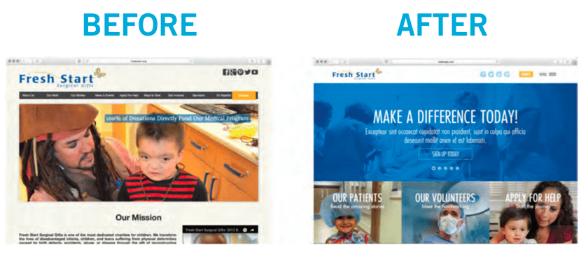
Studies show that a person takes 15 seconds to skim the front page of your website before deciding to leave or not. That’s crucial! If you have multiple tabs and long drop down lists, people may not be pleased. Everyone wants simple and easy navigation, so spend some extra time on it. Here’s a before and after pic of a website we’ve done.
Managing your web content
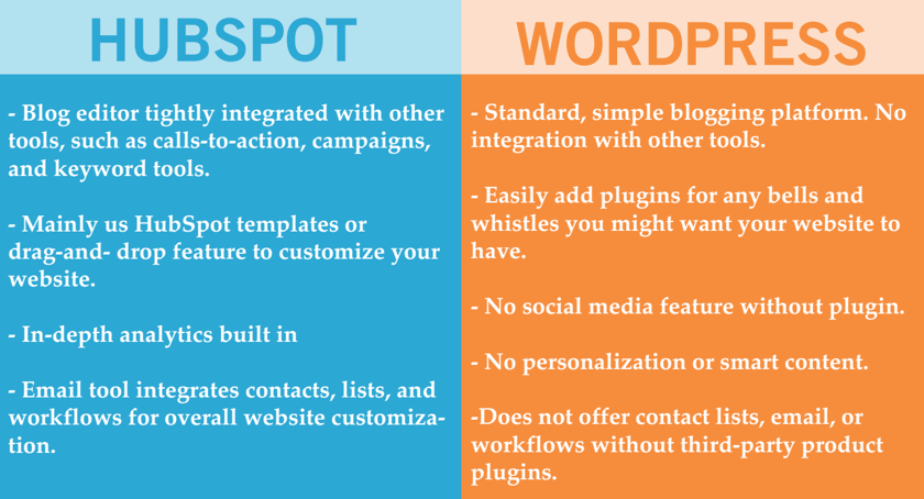
Your next step is finding a content management system (CMS), occasionally known as a WYSIWYG editor, that works for you. Choose wisely. Some things to look for include being easy to use and understand, requiring minimum or no coding for small tasks, easy form builders, drag and drop features, auto saving and backup, simple CTA and landing page creators, data collecting and the ability to set permissions for different users. My recommendation for these would be WordPress or HubSpot, here’s a comparison chart. Be sure to also check out our blog on Getting Started With Wordpress.

Lastly, some parts of your website may not look exactly like your drawing. This part does require a little more advanced HTML and CSS knowledge. Some CMS systems may offer automated CSS coding as well. For example, Adobe Dreamweaver automatically creates CSS code through a feature known as Bootstrap components.
Take your time, and test out all of your programming, small mistakes can cause the website to crash. Configure all the little details, and see how your website looks on multiple devices. Remember to properly format them for tablets and smartphones too. If not optimized for mobile users, your website will be flagged by Google. Google requires to have a mobile-friendly site. If not, crawlers will not go through, and you will lose a big portion of your SEO. If you found this and our previous blogs helpful, download the full guide for free! If you still have questions let us know and we will give you a free website review and go over a plan.
Trust us with your San Diego Web Design and San Diego SEO!


