![]()
When I visit a website, I want to be wowed! It should look beautiful and effortless at the same time. There are details big (like layout) and small (like typography) that can make or break the appeal of a website. It is not an easy task to accomplish. But hey, web design is an art! When I finally found websites that caught my eye, I had to share them with you all. Their use of animation, minimalism, and engaging landing pages was refreshing. I was inspired to think about design from new angles along with web design trends in 2017.
Click here to download our proven recipe to design innovative B2B websites for our clients.
Hope you will be inspired, too! Here are the 9 companies that have crafted the most eye-pleasing B2B website designs.
9 B2B Website Designs that will Catch Your Eye
1) Grammarly: The All-in-One Online Proofreading Tool
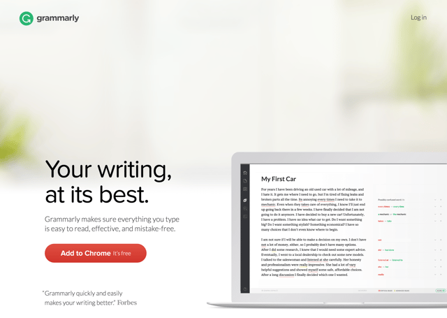
We highlighted Grammarly for the advanced use of animation on their website. The animation serves as a product demo, which gives you a clear idea how their product is used. As you scroll down the page, you see all the services that the product provides and how it can improve your writing. Also, the image gallery at the end of the homepage shows customers of Grammarly and is a warm finishing touch. We love this show of appreciation!
2) Innovative Edge: Launching Businesses towards Success
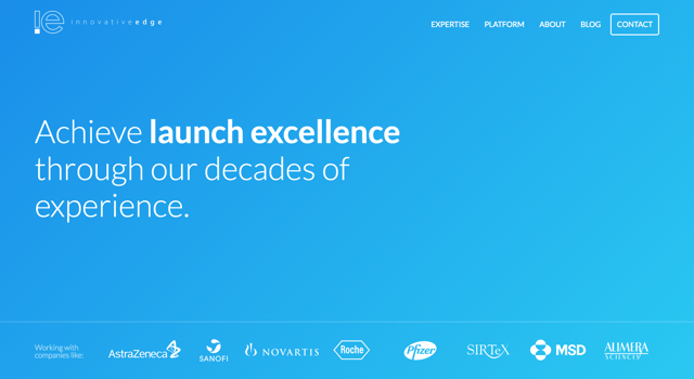
Innovative Edge thought through how to make their contact page fresh and engaging. Instead of a template contact page, IE uses a short form field that asks for basic contact information. The web page is short, sweet and to the point. Functional simplicity at its best!
3) Jaco: Improving User Experience through Observation
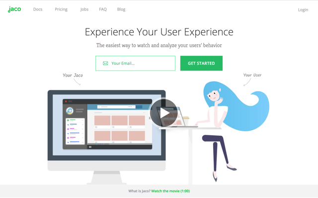
Along with Grammarly, Jaco has fun and helpful animations. When you visit their website, the first item that you see is a video about the company. Scroll down the page to find a useful animation that shows how Jaco records and plays user interactions with your website. The company's website also shows their display for collected user data and some of the available functionality.
4) Pics.io: The Platform to Manage Digital Assets
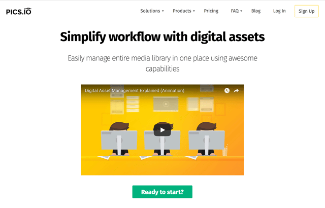
Pics.io uses multiple visuals to demonstrate their product in use (seeing a common theme in this post?). The visuals follow a time line that starts with the first-time set up of the Pics.io platform. More images on the website show how easy it is to store and share digital media using Pics.io. Also, the company chose to display photographs of striking architecture that caught our eye.
5) Pulse 220: Easier Event Management for Corporations
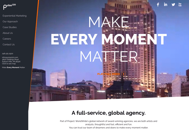
Pulse 220 softens the edges of a traditional website that looks like a series of blocked-off sections. The company uses a unique, card layout for its website. This layout allows Pulse 220 to present their case studies clearly and succinctly. Smart design and topic tags display just the right amount of information for a user on any given page. Pulse 220 pushes forward modern website design.
6) Quid: Visualization and Analysis of the World's Data
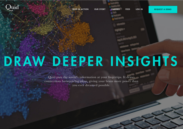
Quid is a perfect example of functional minimalism, which means a design that uses as few elements as possible to carry out a given function. It makes sense that the company that "puts the world's information at your fingertips" would do so. The amount of information in the world is huge! But, Quid uses graphs, colors, and tables to make understanding its complex software much easier. This design style also enables faster load time, better readability, and an improved user experience.
7) Rollpark: Quick and Easy Parking Lot Construction
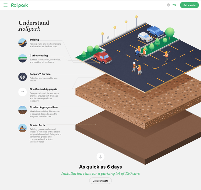
Rollpark is another model of functional minimalism. How else would we understand "fine crushed aggregate" so well? Don't worry, check out Rollpark's website and you will learn what that term means. It was such an innovative idea to have an animation to detail each of the layers needed to construct a parking lot. Kudos on the great idea, Rollpark!
8) YapStone: Towards Better Payment Processing and Solutions
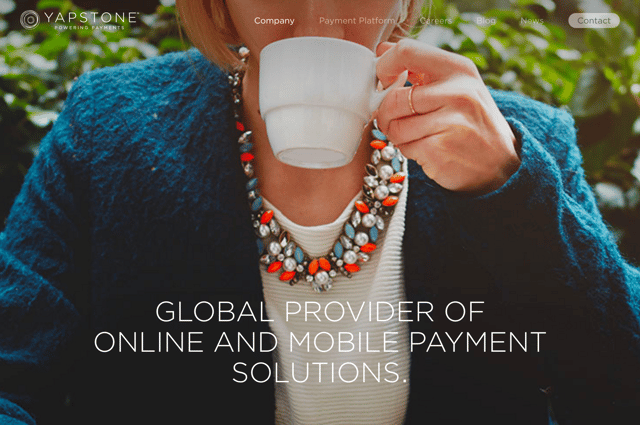
YapStone thought outside of the box to tell their company story, which doubles as a history lesson. Visit the company's website and click on the "Our Story" tab. You can scroll down the time line of images, which tell the story behind the naming of YapStone. The story is inspiring and gives insight into the company's mission. Captivating photography and long scrolling throughout the website improve the user experience and makes the website easy-to-use on any device- desktop, laptop, tablet, or phone.
9) Zendesk: Taking Care of Customer Service
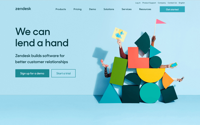
When you visit Zendesk, you instantly feel the fun and playful persona of the company. Zendesk knows how to breath life into customer service software. Their animation often uses simple shapes with bright colors. They reminded me of those blocks that I played with as an infant and that makes me happy. You get the feeling that Zendesk makes customer service as fun and easy as playing with building blocks.
Modern website design is an art that few companies master. We applaud the businesses that have taken on and conquered this challenge! Their B2B website designs blend advanced technologies with smooth design patterns. Let us quickly look back on what these innovative companies did right.
What We Learned
We saw 9 examples of inspiring B2B web design from a variety of companies. Their use of animation, layout, and imagery wowed us with their appearance and ease-of-use. Designs were simple, yet elegant. Feel free to play around on these websites to get first-hand experience. And check out our research on the average cost of a website.
Learn how we can work with you to create a great website in our B2B Website Design guide.
Seen any other website designs recently that caught your eye? Share your insight with a comment below.
Related
- 17 Best SaaS Companies to Disrupt the Software Market in 2017
- 16 Best Designed Eduational Websites that Put Their Students First
Webbege is a leading San Diego B2B website design and digital marketing agency that provides a suite of marketing automation tools. Our clients range from small businesses to Fortune 500 companies. Let's team up and grow your business.
