Typography and web design go hand-in-hand to make a modern website. You may have a great idea for a web design that will make your website responsive and beautiful. Perhaps, you have been inspired by these innovative B2B website designs. But, have you kept in mind how to layout the text on your website? Dense text is difficult to read and makes for a poor user experience.
With such a variety of web fonts, sizes, and colors, laying out website text is a process that requires attention to detail. We share a few web typography best practices to make your website content easy to read and pleasing to the eye.
What are Web Typography Best Practices?
We break down web typography into three main categories: fonts, spacing, and color. Fonts come in many different shapes and sizes. Web designers can make use of standard fonts or create customized fonts. Spacing also plays a key role in typesetting. Proper spacing helps make website text readable and creates a natural hierarchy of text. Lastly, color can give your website personality. Color can be bright or subdued, depending on the personality of a company. Web designers can keep these best practices in mind to design websites that users will read with ease.
Making Text Look Great through Fonts
Font Size Across Platforms:
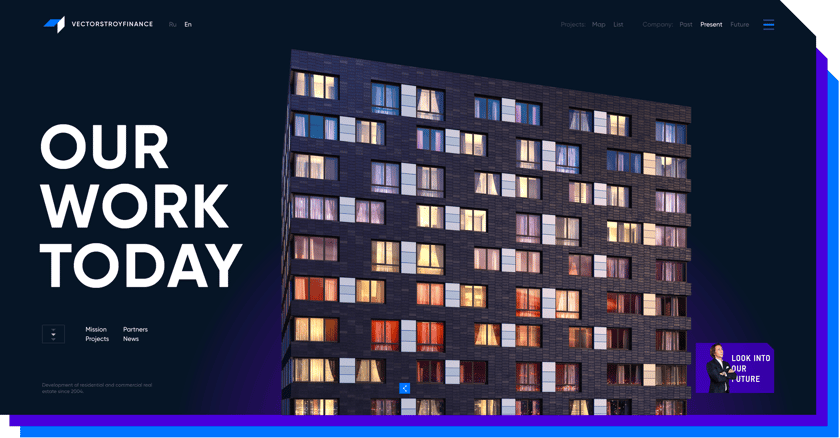
Image Credit: https://vsfinance.ru/en/
Font size, whether big or small, sends a clear message about a company's goals. Large text fills out a website and stands out against a website's background. The text may use all caps and either thick or thin characters to contrast against other elements. Such text is usually defined as characters over 85 points large. Consider having your web text expand to fill the screen and use words of varying size to help your text stand out.
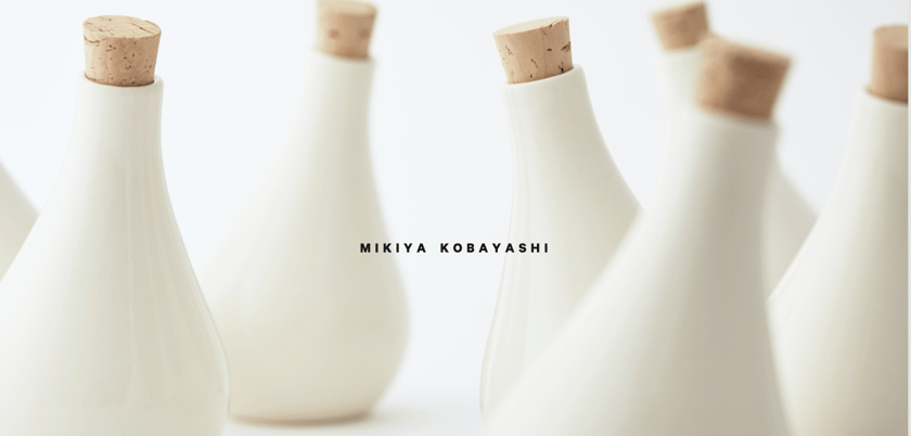
Image Credit: http://www.mikiyakobayashi.com/
Small text can also be just as powerful as large text. Usually, small type uses subtle color. It may be a dark color set against a bright background. Adventurous web designers may set a dark background against small typography with a splash of color. Consider using small text with a striking image to create interest in your users.
Advanced - Creative and Custom Fonts:
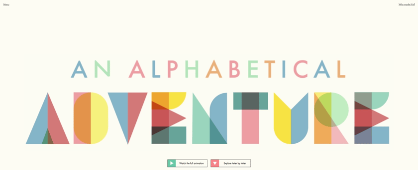
Image Credit: http://www.aisforalbert.com/
Feeling creative? Apply it to your typography and customize your font. Consider mixing text inside your images to create interesting graphics. The goal is to still have the website text be readable though, so make sure that your font is readable. Place your creative font front-and-center on your website and only include a few elements along with the font. This layout will better keep your visitor's attention. Typography and web design are only getting closer!
Freeing up Text through Spacing
Establishing Website Hierarchy:
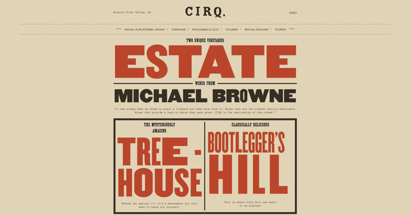
Image Credit: https://www.cirq.com/
When reading content on a website, user's first look at large typography. Font size is used to create a clear-cut hierarchy of website text. Content is grouped and users see where they should start and finish reading content on a website. Size helps different sections of text stand out. Spend some time thinking about how you want users to navigate your website. This thinking will guide the spacing and arrangement of text on your website.
Left, right or center:
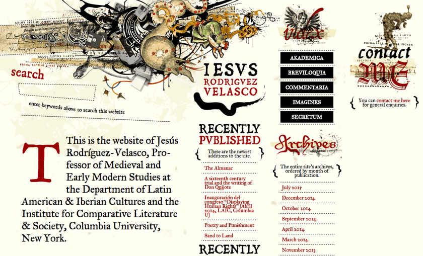
Image Credit: http://www.jrvelasco.com/
Text does not have to be centered to follow web design standards. If your website uses text of many different lengths, a new text alignment may look better. Most readers read a page from left-to-right. So, consider using a left-alignment to make your text more readable. By using left-alignment, web designers can avoid having ragged edges of text, where text does start or end along a uniform line. Readers will feel more comfortable digesting such a website's content.
Bringing Text to Life through Color
Matching up Text Colors:
Image Credit: https://www.truedigital.co.uk/
Color can look breathe life into website text. But, care must be taken in matching up font color with website background. We have all visited a website that used a terrible color scheme that made our eyes hurt. The key is to use complementary colors to make font readable. For this reason, many websites use black text set against a white background. However, there are other color combinations that work well. You may just have to be clever -- and use that ol' color wheel from elementary school -- to come up with well-matched text colors.
Using CSS for Consistent Typography:

Image Credit: https://www.shift-capital.com/
Instead of worrying about consistency across your web typography, use CSS to automatically take care of typography issues. CSS helps ensure font sizes and styles are the same across a website. Learning this technology may take time, but it is worth the investment. You can use CSS to create a typography scheme that uses font size, color, and spacing unique to your website.
Just like that, you are now a whiz in typography! -- well, a wizard in training. We went over many core aspects of web typography, so let us quickly review what we covered.
What We Learned
Remember that typography and web design share a close relationship. Use standard or creative fonts to create neat typefaces for your text. Space out the text on your website to create a natural hierarchy that makes text faster to access. Finally, use color as much or as little as you desire to create a website that showcases your company's personality.
Pair these web typography best practices with these digital marketing tips to drive traffic to your newly designed website! And check out even more award-winning website typography!

Seen any websites that used font size and color smoothly? Share your knowledge in the comment section below.
Related
- 17 Best SaaS Companies to Disrupt the Software Market in 2017
- 16 Best Designed Eduational Websites that Put Their Students First
- 9 Innovative B2B Website Designs to Spark Your Design Creativity
Webbege is a leading San Diego B2B website design and digital marketing agency that provides a suite of marketing automation tools. Our clients range from small businesses to Fortune 500 companies. Let's team up and grow your business.